
In the days before FileMaker 13, maintaining a consistent set of UI elements for a FileMaker app could be a serious challenge. Back then, to address this challenge, I used a dedicated FileMaker file to store my layout designs and objects. When working on a solution’s UI, I would keep this file open nearby to grab objects as needed.
This system worked well until a design change needed to be made, such as changing a font, font size, color, etc. Then I’d have to spend (potentially) hours combing through all the layouts of the solution looking for elements that needed updating to the new look. At best, this was a huge drain on development time. At worst, things got missed, introducing inconsistencies into what was intended to be a finely-crafted interface.
Revving up FileMaker’s (Theme) Engine
Then Claris introduced Themes to FileMaker and there was much rejoicing!
Well, not exactly.
Old habits die hard. I didn’t retire my UI style file immediately and the theming engine itself had a not-insignificant learning curve and a few not-quite-showstopping limitations. However, over time the FileMaker theming engine got better and I learned how to use it more effectively. My UI designs got better as it became easier to manage even complex designs across even hundreds of layouts. Now was the time for much rejoicing!!
Well, almost.
The problem I still wrestled with when working with FileMaker themes was useful style naming. Coming up with a manageable naming system so that I know what an object will look like, and even the role it plays in the UI, has been a challenge. My themes sometimes devolved into lists of non-explanatory style names and duplicate styles.
CSS to the Rescue
I finally hit on a solution for creating a manageable theme when I took a deeper look at the FileMaker Standards recommendation for naming layout objects. If you haven’t started using FileMaker Standards for coding standards, do yourself a favor, and check them out today.
In their recommendation, they suggest using a prefix and dot to keep layout objects organized.
My web developer side saw a ray of light in this methodology. FileMaker Standards was essentially giving layout objects a Class (actually since layout object names have to be unique, they operate more like CSS IDs, but I hope you’ll forgive the deviation to make this analogy). Using this method allows you to quickly identify what the object is and what it does.
Eureka!
Why not use a Class-like naming convention for my theme styles? It was a Eureka moment.
After some experimentation, I came up with a theme style naming convention that I think makes clear what a style will look like and/or what role the style plays in the UI.
Let’s start by looking at the naming format.
What’s in a name?
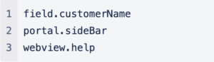
At its root, every style is defined by the type of object to which it is tied. So the simplest style name would simply be the object prefix.
Here is the style name format map I use in my styles:
[object type].[class name].[horizontal alignment].[vertical alignment].[bg(image|gradient|color)].[color(color)].[size(size).[style(bold|italic).[icon(color)].[border(size)].[radius(size)].[shadow(inner|outer)]
For example, btn would be the style associated with a basic button. This doesn’t pass much information about the styles but is useful when acting as the default style for an object. So the btn style might be bright green with white text and a white icon.
Common Object Type Prefixes
- btn = Button // btn.alert- bb = Button bar // bb- cal = Calendar // cal.left- check = Checkbox Set // check.common- chrt = Chart / Graph // chrt.dashboard- cont = Container // cont.photo- dev = Developer // dev.note- ddl = Drop-down list // ddl.navigation- edit = Edit box // edit.left.middle- label = Field label // label.left.middle- layout = Layout Background // layout.dark- menu = Pop-up menu // menu.left.middle- part = Layout part // part.primary.border(0020)- pop = Popover // pop.light.border(1)- portal = Portal // portal.border(1)- shape = Shape object // shape.logo- slide = Slide control // slide.border(1)- tab = Tab panel // tab.border(1)- txt = Text box // txt.bg(gray)- web = Web viewer // web.border(2)
Why not use the Default style provided by FileMaker? That is a complicated question beyond the scope of this article, but Matt Petrowsky lays out a solid argument for not using the Default style in a theme for your layout objects. Check it out here.
Since every solution will invariably use more than one style of button, using a CSS-like dot separator allows you to define more complex styles which allow you to easily identify the style’s look in the Styles Inspector panel.
So let’s say I want to create a new button that’s going to be light gray so it’s de-emphasized on layouts. I could approach it two ways:
- Assign the button a descriptive class that explains its role in the UI.
btn.passive, for example. This doesn’t give me specific color style information, but it does tell me that this button is passive or de-emphasized relative to other buttons. - Explicitly state the colors used in the button. Example,
btn.bg(gray).color(white)
Using this method gives you flexibility when defining new styles as your theme gets more complex while keeping it manageable.
A Few More Examples
Here are a few more examples to demonstrate how the naming convention works:
An edit box with text aligned to the left and top, a gray background, a border of 1 pt on all sides and a radius of 5 pt on all cornersedit.left.top.bg(gray).border(1).radius(5)
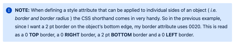
A drop down list with text aligned to the center and middle, no background, a border of 2 pt on the bottom edge and no radius.ddl.center.middle.border(0020)
A pop-up menu with a specialized role, such as navigation, that has a predefined set of styles to create a specific look can be given a class name instead of explicitly detailing the styles. Explicit styles could be paired with a class name to create different versions of the same element. Multiple class names can be used to create different versions of the same element.menu.navigation
menu.navigation.dark
menu.navigation.light
A Slight Hiccup
One drawback to defining every style in the style name is length. Let’s see the problem in one of the earlier examples: an edit box with text aligned to the left and top, a gray background, a border of 1 pt on all sides and a radius of 5 pt on all corners.
The resulting name isedit.left.top.bg(gray).border(1).radius(5)
This is already a moderately long style name. Add an explicitly declared background color or other style and it can get really long, really fast.
This isn’t a show-stopper, but it also isn’t a completely trivial issue. In this particular case, I would be inclined to give the style a descriptive class name, i.e. edit.common.left or edit.standard.left. This gives me a shorter but still-useful style name.
I’ve included a simple file for download with a theme using a CSS-like naming convention. I hope you find this CSS-like approach as useful as I found it.
Keep on FileMakin’.

Built with you in mind
Speak to one of our expert consultants about making sense of your data today. During
this free consultation, we'll address your questions, learn more about your business, and
make some immediate recommendations.